 In this current economic crisis where everyone from Toyota down is feeling the pain, Land Rover – by the very nature of their product portfolio – is hurting more than most: we can only hope that this spurs Tata to fast-track the production LRX rather than delay it – a new compact, efficient model is exactly what LR needs. The reborn Range Rover, Discovery 3, Range Rover Sport and Freelander II are all products of a marque fully in control of their design language; the only bum note are the indignities foisted upon the Defender, but these were apparently the fallout from a change of engine and pretty minor anyway. In many ways LR is an object lesson in managing visual identity: the Defender, Freelander, Discovery, RR Sport and Range Rover each have their own distinct identity but all are recognisably a Land Rover. Of course it helps there are relatively few model lines (each with few iterations) and they share a common theme (off road ability) - but it still an impressive achievement: compare & contrast with the woeful state of Jeep design.
The original Range Rover not only created a niche (long before doing so became a standard tactic) but was a design classic that remained in production for nearly 25 years. I'm sure it's replacement was a very good car, but I could never get past the overgrown Talbot Horizon looks. The third generation was an incredible return to form – a design that not only incorporated classic elements ('cab back' proportions, castellated clamshell bonnet, three plane surfacing of flanks) without descending into pastiche, but built and expanded the design language with new elements – such as the overlapping, cropped circle motif of the headlights and the gill sidevents – that looked perfectly in place. The interior remains one of the best in any car past or present.
As good as RR III was, the Discovery III was even more impressive – although instantly recognisable as a Disco, it was and even bigger and braver step forward. Like the Rangie, it incorporated both the old (stepped roof, proportions, graphics) and added new elements: the most apparent and radical was the simple, almost stark, surfacing lending to what is in fact a pretty complex form an air of minimalism. There was also the character line that 'fades' out in the middle, and whilst the asymmetric windowline of the tailgate is technically carried over from the previous generation, but now that the spare wheel is mounted under the tail it's a vestigial feature – however Land Rover have cleverly realised that this feature is associated with 4x4's generally and have added to their visual repertoire.
They do however need to reign in their detailing: although not alone in this, it has been getting increasingly busy of late. On the Range Rover, the simple grille bars of the original have been replaced by fussy, perforated plasticky items in the facelift. I get it: they're supposed to be redolent of high end cooking knifes. I like the cutlery in question, but it doesn't follow that I'll like low-rent, cheap looking copies: silvered plastic looks like silvered plastic - not brushed metal, even from a distance. LR have also succumbed to the cult of the sidevent; on the original Rangie they fit perfectly (more than can be said for any current Jag) – but less so after the facelift. That it's driver side only on the Disco leads us to assume it's functional, but the RR Sport and especially the Freelander 2 are less convincing – and even if the vents are required, do they have to be so gaudy?
Although I love the design of current Landies, I simply couldn't conscience owning one. I don't do enough towing that could justify a Rangie, and don't think anything can justify the Disco's Integrated Body Frame (“Can't choose between a chassis and a monocoque? Why not have both?” Just don't ask how much it weighs....) The RR Sport, like the X5 & Cayenne, is big and clever only in the most literal of senses - just because you can do something it doesn't mean you should, and isn't as good looking as it should have been (or as good looking as the Rangie or Disco.) I respect the Freelander II but it doesn't appeal personally and whilst glad we live in a world were the Defender is still made, don't need & wouldn't want to own one. So until acquiring a Series 1 Landie and pre-'81 3 door Range Rover for my dream garage I had resigned myself to admiring them from afar - until the LRX: here is a Land Rover that I could see myself owning. So please forgive me if my analysis assumes a production future, but this is only the company's second fully fledged concept but the Range Stormer did herald the arrival of a new model line; let's hope the LRX translates a little better into production than the RR Sport did.
The various Land Rover models are differing ratios of ruggedness and luxury. The Defender is obviously ground zero for rugged, and the Range Rover is a jacked up luxury car that happens to be overbuilt. The Freelander & Discovery are more utilitarian that the Rangie; the Range Rover Sport less so, and tries – with mixed results – to add sportiness to the equation. The LRX feels distinctly sybaritic; this is in no small part due to the interior. What it tells us in literal terms about the production item is hard to say – but the mood, choice and use of materials was significant: this is high end chic not outback utility.
Although there's quite a lot going on at the front of the LRX at no point does it feel cluttered or busy. In fact, given the slight tendency to overdesign regarding detailing on production LRs, they've been remarkably restrained – the bonnet vent being the only offender. The stepped motif used extensively throughout is not truly new (little is) but the fact that the LR team have not only integrated it well but used it in an interesting and skilfull manner, making it their own shows that they're on top of their game generally. The surfacing – good generally is spot on at the front & in conjunction with the superbly judged plan form makes a powerful impression. In conjunction with the lower intakes, the plan form diffuses what would otherwise have been a bluff, unfriendly nose, making it instead svelte & powerful. The oversize honeycomb detail is the best interpretation yet of the current LR grille detailing. The nested 'sump guard' is neatly handled and the nicely integrated intake above forms the lower element of a dog bone graphic which gives it a planted look without feeling too bulky. Again, the lower intakes help here, breaking up an otherwise large expanse. Given the current popularity of faux intakes the blank recessed half of this feature is crisp, refreshing and honest; the front fog lights neatly ties things together.
The clamshell bonnet is a familiar cue, though increasingly common elsewhere (a side effect of ped. safety regs) but lacks the traditional castellation and in truth doesn't need it – the familiar Land Rover badging on the leading edge is more than sufficient. The intrusion of the wheelarch into the bonnet shutline is a subtle detail that helps emphasise the wheelarch without resorting to a larger surfacing feature that could look overblown or clumsy.
The Range Stormer had a whiff of caricature about it and I hope this is the case with the LRX. One thing that will need careful monitoring in the transition to presumed production is the wheels: at 20”, the LRX's rims aren't excessively large for a concept but the full size sidewall does mean that the overall diameter is large and – unlike most concept cars – a proper wheelarch clearance means that there is a real danger of the production version looking overbodied. The combination of falling roofline and rising beltline make the taper of the glasshouse look exaggerated; in addition, a fuselage graphic that doesn't really develop over the cars length – the sill line is essentially parallel to the beltline – make it look a little nose heavy overall. The chrome trim in dark grey of the lower flanks has parallels with the Discovery's rear screen line in that it seems to be a stylistic interpretation of a feature once functional now vestigial – in this case a running board: it adds interest without resorting to inappropriate side skirt forms.
The rear end also needs a little work – the light units could be a little bigger and the brightwork fails to convince: it doesn't pick up the detail in the light unit itself clearly and as a consequence looks isolated. The surfacing lacks the sophistication shown elsewhere, particularly in the lower part of the tailgate – surely some variation of the stepped motif depolyed at the front could have been used? Some interest needs adding in the lower corners – but production will dictate fog / reversing lights & reflectors, etc so this should take care of itself.
Overall, the LRX is a well executed concept that hopefully signposts the way to a production reality.
 At the macro level, the Volt seems torn between two opposing forces – the mechanical packaging and attempting to stay faithful to the concept. Regardless of your position regarding the latter, it's difficult to deny that the Volt is the most distinctive of the new mass-market hybrid trio: the Prius is closer to a monovolume than the Volt and it's front and rear overhangs are pretty balanced, the same is true of the Insight but it sits on a shorter wheelbase. The Volt by contrast has a more long-nose-short-tail proportions and a definite bustle at the back.
The only way that the Volt could be developed in the reasonable timeframe was by using an existing platform (in this case the Delta II) plus as many standard components as possible, which has dictated certain fundamentals of the mechanical package, such as the engine. As much as we share, there are times when the differences between Britain and the States couldn't be clearer: speaking on The Colbert Report, Bob Lutz referred to the 1.4l engine as a 'tiny little four cylinder engine' (what is it with Americans and cylinder count?) Would this be the same 1.4l engine that will be used in it's non-hybrid sister Cruze? Granted, it's detuned in the Volt and turbocharged in the Cruze, but let's hope they drop in a smaller engine asap: the 1.0l engine in the current Corsa produces more power than the Volt's version of the 1.4l and at the very least this has to be more compact and lighter, making it even more efficient. Beyond that, there are even smaller and more efficient units out there – they could even (whisper it) use a diesel unit.
The Prius' engine is bigger than the Volt's (by 400cc) and has to accommodate a drivetrain for the IC engine which the Volt doesn't – but it has a noticeably bigger nose: that this isn't immediately apparent at first glance is something that should be praised in the styling. The nose itself is pretty 'square', i.e. the bonnet height and front overhang are about the same, and the difference between the overhangs also emphasises the nose. However it assumed this is all fallout from having to use existing components and additionally packaging the hybrid gubbins, with maybe a dash of aero on top.
Although the nose works quite well at a macro level, closer examination reveal some problems. The surface detailing is a bit timid and the surfacing a little vague – it might be assumed that there is an aerodynamic reason for this, but both the new Prius and especially the Insight have more form in the front. Of course, neither of them has the big, bluff nose of the Volt but this is one area where staying more faithful to the Volt concept might have been beneficial, or even more in line with current Chevy saloons. The grille needs work; it looks cheap, and while it may be non-functional does it really have to broadcast the fact so obviously?
Given that the internal combustion element is an overgrown battery charger why have what appears to be a conventional bonnet? Surely an access panel for fluids and charging socket would have been sufficient. Given the limited possibilities for home maintenance on modern engines bonnets are an anachronism: a light removable panel would suffice – and who might be more accepting of this than owner of a hybrid? - and would save weight. Given that it's a four seater, why keep the lower rear screen? Although this obviously references the concept, it's also a feature shared with both the Prius & Insight.
Overall, the Volt has a more planted stance than might be otherwise expected, subtly helped by the relatively large wheels and the classic stepped lower body mouldings, rising towards the rear. But it's a close thing - the Volts we've seen thus far have been shown on 18” rims (the Prius rolls on 15”s); let us hope someone makes energy efficient tyres in this size as it'll look overbodied on anything smaller. The DLO extension is a clever and unique feature: without it, the Volt would look more bloated & heavy as the DLO area is actually quite small. The matt finish & underlining chrome trim means it should work for darker colours too. The only question is how it will age, especially if it's component parts are made from slightly different plastic compounds: it may end up looking tatty.
The base of the A-pillar was fussy to start with and unfortunately the few changes evident in the pre-production spyshots have not improved matters, making this area even more cluttered. The new diagonal fender / A-pillar cutline jars, the original horizontal position was better. The bonnet is now a clamshell and the shutline doesn't quite align with the charging area trim. Which is no longer the charging point: a standard circular fuel filler cap has been inserted.
Given the aerodynamic sophistication & attention to detail evident on the upper surfaces, it's almost inconceivable that the same rigour hasn't beem applied to the underbody, especially since this in a relatively easy win, but GM have given few details about this and it's something manufacturers normally like to crow about.
At this stage I've yet to sit in a Volt, but the interior certainly looks finished to a high standard generally, and particularly for an American car. Although it might seem churlish to criticise it on that basis, if interior quality was an issue for the US consumer they wouldn't stand for some of the crap out there so one does have to question whether GM will see a return on it's additional investment here.
Which brings us neatly onto what I think is the elephant in the corner: price
The Volt is significantly more expensive that both the Prius and Insight II. As the first series hybrid it offers the potential for largely petrol free driving – and therefore lower running costs – but will this, and being US made, be enough on the forecourt? Time and time again, consumers the world over have a habit of choosing the option that's initially cheaper, even if they know it's costlier in the long term: witness the poor take up of energy efficient light bulbs.
Either way, it will take more than the Volt to save GM. As much as the big three have frustrated with their mismanagement and disregard for all except the shareholder, they have produced – almost in spite of themselves – some great products that make the automotive world a more interesting place. Hopefully they now realise that they can't subsist on pickups and SUVs and need once again to focus on making cars the world needs and desirable enough to want.
 I admit it. I didn't pay too much heed to the Volt concept: I assumed it was another piece of eco-tokenist misdirection with little true bearing on the showroom reality anytime in the near future ('No, don't look at the BOF SUV with an iron age V8 that actually constitutes our bottom line - look at the shiny eco-car concept, isn't it cuuuute!'); even if I had realised GM were serious this time I still wouldn't have had any expectation that this concept was a template for production: styling was going be a long way down the list of priorities. As a production model from one of the Big Three (™) it's potential significance was huge, but this concept was clearly nowhere near production and on a purely stylistic level there seemed little of note or relevance here.
Preview concepts are essentially what the punters will find in the showrooms 6-18 months hence, and are now such an established part of the development model that some manufacturers actually name them as such. Usually they are the future production item with bigger wheels plus some polished / milled / brushed (delete as appropriate) alloy detailing that – if it makes it to production at all – will have been transformed into a too-shiny cheap looking plastic item. To anything but the most casual observer it was clear that the concept Volt was not such a beast. Further examination would have also indicated that this was unlikely to be a showcase concept (like the Ford Iosis), used to introduce a new design direction – there wasn't anything feasible or coherent that could be used, and GM didn't make a big enough deal out of it (design wise) as they would if this was the Next Big Thing.
I guess an LEV concept that doesn't set out to deliberately wound the eye should count as some sort of progress, but if this juvenile caricature were a conventional car then I'm sure the response would have been quite different. I've seen some praise for it's 'muscle car looks' – could someone please clarify exactly which muscle car this looks like? With its large (even for a concept car) wheels pushed out to the very extremes of the body it looks oddly stumpy; the long nose, 'cab back' design and ridiculously exaggerated wheelarches are meant to communicate power, but seem a little, er... overcompensatory. Especially for a hybrid.
The beltline is unusually low in comparison to the scuttle height; the reason for which seems to be the exaggerated wedge profile which - instead of deploying any of the standard tricks - is literally just that. This sets up a strange conflict between the pillar box greenhouse and more normally proportioned DLO. To dig themselves out of this hole, the shoulder line is carried through the side glazing, which is.... unique. This is the worst kind of stylistic gimmick: a feature that could never be realised in production and lacks any intrinsic design or aesthetic merit; it smacks of one of those random 'ideas' that arises in the absence of anything else.
The base of the A-pillar is a mess, and the odd wing mirror placement doesn't help; the scuttle area is cluttered with odd shaped panels and shutlines with no obvious purpose. The A-pillar itself was painted a dark silver so that it relates to nothing else – surely it should have either been body colour or black (as per the rendered images.) A (fussy) feature has been made of the charging sockets but the fuel filler is an afterthought. The bonnet shutline is contrived; the encroaching fender shutline is presumably meant to make the front wing & wheels look even bigger and more muscular, but just looks clumsy; and the door shutline / DLO graphic is no better.
Were it not for the wheelarches themselves there wouldn't be any planform to speak of; at the front, the headlights are confined entirely to the front elevation, reinforcing the squared off feel. The more complex form adds interest at the back but the wedge shape means that the rear deck pretty much bisects the drivers rear view, rendering the lower rear screen of little practical use. The slim, horizontal biased lights – good in isolation – in this context seem almost intended to emphasise the height & bluffness of the tail, though the form in the corner above the wheelarch relieves this is little.
The surfacing is handled pretty well, and some of the detailing in the lower front air dam is quite subtle and well resolved. The character line trailing from the wheelarch lip into the lower portion of the doors is a neat feature which ties things together well: the nose would look even more exaggerated without it, though the socket feature and raked front door shutline also help in this regard.
In summary: meh
Another cartoonish concept to round out the quota for that year's Detroit show. This also seemed to be the general consensus as well; until the first images of the production Volt emerged.....
**Haven't posted anything in a while but seem to have had a lot stuff on my hard drive in a nearly finished state for months and months; making and effort to catch up in the next few weeks. The Volt piece is so big I've chopped it up into separate posts to make it a little easier to digest**
This will not be a comparison of the concept and production Volt. The concept was not a particularly successful exercise; certainly not worth emulating - with it's boxy, cartoonish proportions that were never production feasible. It was hardly showered with praise upon it's debut, so the storm of controversy must have been doubly surprising to GM: isn't it enough that it's a major breakthrough – both in technology and culture – for them without having to be a roadgoing concept car as well? The Chevy Volt is an important car for many and various reasons, but the styling isn't one of them (and that works quite well anyway) though GM did make a rod for it's own back by promising to keep faithful to a frankly ugly concept car. This has caused a flurry of comment from sad fanboys on the internet who think that having a blog and an opinion actually mean that their views are somehow important....
...er, *cough*
Anyway - after years of kicking & screaming (whilst Toyota & Honda quietly got on with) GM is the first of the troubled big three to seriously pursue the next wave of drivetrain technology, and has done so with a vengeance. Without hailing the Volt is some kind of latter day Model T, it does represent a fundamental shift in the American motoring landscape – a change that could have only been effected by one of the native brands. Given that the EV1 appeared 12 years ago and was a limited scale pure EV (rather than a hybrid), one has to wonder at the pool of knowledge that GM had to draw upon – making the Volt's development time even more remarkable.
If we ignore the radical drivetrain, this is a bread-and-butter 4 door saloon - so why should it look like concept car any more than any other 4 door saloon? I haven't seen much criticism of the new Cruze for failing to be gorgeous and the 'controversy' surrounding the Volt's styling is irritating on a number of levels.
First, a statement was made that the production item would stay as faithful to the concept as possible. Whilst I have the greatest of respect for Mr Lutz might I suggest that this was, in retrospect, a mistake? It set an expectation that could not realistically be delivered – and many chose to take that statement at face value rather than heed the evidence of their own eyes (see Volt concept analysis). Given the scale and nature of the difference between the concept & production items, it can be inferred that production Volt was at a very early stage when the concept was shown, otherwise it would have been better stage managed – look at the development paths of the Ford Iosis through to Mondeo III and Opel GTC Geneva to Astra 3 door as more typical examples of how this should work. When you dial in the fact that even with today's reduced lead times, developing any vehicle in this timescale would be a challenge, never mind one that is not only a radical change of direction for the company concerned - but a mass market first for anyone, the idea that it would be drop dead gorgeous or faithful to the concept looks increasingly naive. The fact that some of the mainstream motoring press chimed in with this view was particularly disappointing; they should know better.
Second, there seems to be a lack of recognition of what stage the LEV market is at. We are used to the idea of the car as mature product, since not long after Harley Earl established the Art and Colour department in 1927, but (for the moment at least) the alternative drive technology is a USP that aces the usual factors such as style, safety or performance. To draw a parallel with the mobile phone, we're somewhere in the early-to-mid nineties: the 2G network had been launched in 1991 but the infrastructure was patchy; whilst still rare, phones were no longer the reserve of stockbrokers but still a long way from general acceptance. At that point what it looked like, how it felt in the hand, how easy the interfaces were to navigate were irrelevant – as long it worked and was affordable, it's utility alone was enough to sell it. It wasn't until the cusp of the millenium that interchangeable covers - one of the earliest expressions of fashion in mobile phones – started to appear. The mobile phone was becoming a mature product, i.e. it's core functionality could be assumed, and thus other factors start to become more important as market differentiators: useability, style, status, additional features (today it's got to the point where the issue for those serving in the armed forces is finding a phone that doesn't have a camera.)
Look at the G-Wiz: an ugly death trap with an interior that makes a cardboard box look luxurious, on sale for the price of a proper car: who can honestly argue that Reva would have sold a single example were it not an EV? OK, hybrids are a little further along the curve, but developing a mass market hybrid intended as an everyday vehicle is a still a big deal, and in the case of the Volt the prospect of potentially petrol free motoring is what will sell the car more than – and possibly in spite of – anything else. Producing such a vehicle that not only meets the actual (80% of Americans travel less than 40 miles a day), but the perceived needs of the user was always going to be a challenge. Although most of the required technologies have progressed enormously in the last decade there are still great limitations, and these dictated that efficiency was king (and will remain so until the energy density of batteries significantly increases) when developing the Volt. As far as aesthetics goes this means aerodynamics.
Third – how many of those most vocal in their criticism were ever likely to actually buy one? However good or bad it is (or looks), it's not likely to be at the top of any petrolheads shopping list: this is car as appliance. Newsflash: enthusiasts are a minority – look at the sales chart: it does not read like a petrolheads wishlist. Hard though that seems to be for some to grasp, there are people out there for whom a car is a mode of transport and nothing more. If they have any sense, GM will ignore the embittered ranting of individuals who were never likely to be customers anyway.
Finally, the Honda Insight II is - externally at least - pretty much a clone of the Prius; yet I have yet to see a word of criticism on this regard. In fact, of the purpose built hybrids the Volt is the looker of the bunch; this is particularly impressive when you consider that the Volt's major dimensions are all within a couple of inches of the Prius. If car companies are going to be hounded into big efficiency gains in the short term, get used to convergence: there are few optimum aerodynamic solutions (BTW, when private cars have further reduced the 10% of the overall emissions they're actually responsible for, will they finally go after the main offenders?)
Ultimately, that what is shaping up to be an impressive achievement is being overshadowed by a criticism that it fails to match unrealistic expectations in one particular aspect is really quite objectionable.
...and destined to always remain so. As much as I love Top Gear I can't agree with their views regarding the Tesla vs. Honda FCS Clarity (S12E07); they've focussed on one single aspect - refuelling - and reverse engineered a conclusion from that. Hydrogen is the fuel of the future in the same way that nuclear fusion is the energy of the future: both hold the promise of clean, cheap energy but seem to be perpetually 10-20 years away.
In hydrogen's case, it's as if the elegance / simplicity of the 'hydrogen is extracted from, and after use, returns to water' argument blinds us to the fundamental stumbling blocks: production – it takes more energy to extract than it subsequently yields (by orders of magnitude); and distribution - it's kinda volatile (even more so than petrol.) Like Fox Moulder, I want to believe but I can't ignore facts just because the 'solution' appears poetically symmetrical.
 I'm probably being oversensitive, but in the course of my cyber travels I've seen an increasing number of self-appointed experts on web forums, generally American, dismissively blaming any slightly ugly nose on a new car as the direct result of compliance with the European pedestrian safety regulations.
Bollocks. The Peugeot 407 does have a big nose, but the Mini doesn't; both are compliant. Look at the Seat Exeo: a reskinned old-gen Audi A4 - see how few changes were necessary to make it compliant. The legislation's been in place long enough, and there are enough euro-compliant designs in production that aren't in dire need of a remedial rhinoplasty that it can be argued if there is a failing, it is now with the engineering depts of the offenders who've yet to get a handle on it.
So the arrival of the facelifted Acura TL truly warmed the cockles of my heart. Not only has it's nose been pulped by the ugly stick, the Acura brand is not sold in Europe – it started as, and remains primarily, a North American brand.
This one's all on you.
Part 2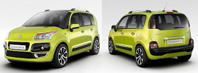 C3 Picasso
The new C3 Picasso is the newest addition to what is already a pretty comprehensive MPV line up, fitting somewhere in amongst the Berlingo, Xsara Picasso (which will remain on sale), C4 Picasso & Grande Picasso and is possibly my favourite thing at Paris this year. It's kind of a funky & functional rather than utilitarian, friendly without being retro - could this be the first MPV you might actually want to buy? The overall effect is boxy with large radiussed corners, functional but not spartan, and quite distinct from most other MPVs. It looks set for the urban jungle too, although it's friendly rather than threatening the chunky rubstrips and bumper (rear especially) give it a rugged feel without resorting to pseudo off-roader clichés: Citroën seem to have judged it perfectly.
The slim, blacked out pre-A pillar gives better visibility and helps reinforce the boxy theme. I'm a little surprised that the elements of the front corner aren't tied together in unifying graphic like that hinted at in the C-Buggy & C-Airplay, but thus far only seen in production on the C4 Picasso's. Otherwise the front works quite well, though the edge surrounding the headlight is a bit unnecessary. However there is a certain honesty about the front graphics: the inlets are mounted where they're needed (low down) and the central elements are fully functioning, i.e. they don't have significant portions blanked off as is so common these days.
The vertical back end works well; the planform at the corners, curve at the top in profile and chunky rear bumper soften what could have otherwise looked van like. There is some nice detailing even if, in reality, the secondary lights in the bumper are probably vulnerable to damage when loading. It sits nicely on it's wheelbase and has a planted stance and though the lip around the wheelarches is quite thick, the wheelarch form itself isn't too exaggerated and smoothly integrated into the flanks.
In fact my major problem is not with the C3 Picasso, but the Berlingo: why, in the name of all that is holy, did they launch this when they have the capability of producing cars of the C3 Picasso's quality? Citroën must hope that the average Berlingo buyer really needs the space (it's bigger than the C3 Picasso.) One assumes that no C3 Grand Picasso is planned, otherwise it's really screwed...
GTbyCitroën  One of the undoubted show stars, the Citroën GT is a pure concept but it doesn't quite do it for me. However, given the pretty universally good reception given elsewhere I am starting to question my own judgement. It's not that I didn't like it, I just wasn't fussed; like so much stuff these days, it works well from a couple of specific viewpoints but poorly everywhere inbetween. The front elevation has the aspect of a crab with it's legs tucked up: the dull central form – a smooth soap bar with a nondescript grille – being the carapace and the wheelarch / side intakes the claws/legs. The press release explanation of the overhanging tail sets a new standard for marketing bollocks: it was 'made exaggeratedly long in order to create an effect of retinal persistence'. Rather than a single, integrated whole, it looks like central ovoid body onto which various appendages have been grafted. As with the odd shaped C-Metisse, I found the interior of the GT far more interesting. Admittedly, I don't see polished copper IPs catching on anytime soon (however cool they look) – but if one of the roles for such concept cars is to inspire then it succeeds on that basis; and car interiors are in need of inspiration.
Maybe it takes more than a pure concept to get me excited – but I loved the Mazda Furai, despite all that guff about it being shaped by the wind (if so, why don't LMP cars look like this already?) In terms of pure theatre, it's not a patch on Batmans Tumbler (but nothing from the 'proper' car designers is either). Sculpturally, the soon to be replaced current F1 generation have got some many things going on, even if the overall effect is dramatic rather than beautiful.
The C-GT is the latest and cleverest in a series of GT tie-ins. TVRs appearance in a videogame, in combination with it's unavailability (as opposed to unobtainability) in many markets made it beyond cool to generation of gamers. Unfortunately, this culminated in the Tuscan Speed Six's appearance in Swordfish – so, swings and roundabouts then... As an ambassador for the brand it's great and making it available in the game is a good move.
As a Citroëniste, I think it's supreme irrelevance is possibly why it left me cold. With the exception of the SM, Citroën has never made a sports car in the past, and even before the current difficulties they were unlikely to in the future. I'm struggling to see anything that relates to their current or future design language – take the badges off and it could be anything. It's primary drive is novelty, and as consumers become ever more design literate, there needs to be a little more substance.
Golf VI Timeless. Classic. Mature. As far as the new Golf VI is concerned, these are euphemisms for what it actually is: boring. And who thought that this staid effort was best showcased in mid-tone, mediocre metallic blue? (Odd that the new Ka was launched in a similar colour – is this the new black?) It looks much better in silver and it needs all the help it can get. The Golf V was hailed as a return to form in a number of regards, and styling was one of them. To these eyes, the Golf VI seems to be stuck halfway between the IV & V. With Touareg taillights - only they're not: if costs are such an issue why not use the rather tidy Golf Plus units? They're so rare hardly anyone would notice...
According to VW themselves they wanted to 're-establish the unadorned look' of the Golf IV but they've not been very successful. The key to this look in the Golf IV was it's clean graphics (such as headlamp shape) simple surfaces, and elegant shutlines; the Golf V was more complex, but there remained a coherence lacking in this new iteration. The headlights are a complex shape, as are the upper & lower grilles. This is the first horizontally oriented grille on Walter de Silva's watch and it's..... really quite anonymous. Which is presumably why they made the VW badge so big (by Golf X it could be a threat to pedestrian NCAP ratings). Scaling is an issue - the thin chrome trim on the upper grille vanes (which call to mind the speaker grille of a mono Decca radio cassette player I had in the 70s) contrast poorly with the oversize detailing of the badge itself. The trim around the lower grille does work; it's at a remove from the badge forms a neat virtual lightline tracing the shape of the intake, but why isn't the line carried up through the lights and bonnet more cleanly – it gets lost in the upper grille / headlight area.
The unadorned aspect may refer to the body sides: from the front ¾ the only features of the body side are the shoulder line and the door handle - as is the fashion these days rubstrips have been abandoned, and the effect is quite pleasing. It's a similar story from the rear ¾ but unlike the IV, the taillights are sort of rectangular but actually a complex shape and interrupt the strong, clean shutline that defines the C-pillar graphic which has not only been a cornerstone of the Golf identity of late, but added tension to the rear ¾ – giving a planted look – to even a 1.4CL on steel rims. While more complex, the rear end does improve on the Golf V: the crisp detailing adds a focus previously lacking.
Even though there was quite a lot of form in the rear bumper of the Golf V, one was always left with the impression of a saggy arse because the eye had nothing to latch onto – the whole tail was a slippery slope, heightened by the fact that overall form widened towards the base and the bodycolour / grey plastic border was at the widest point. Here the edge in the lower lip of the tailgate is stronger, the tighter upper radius of the bumper itself, and the character line just above the rear reflectors which adds a highlight work together to give a more defined look; extending the painted area all the way down also helps.
The Golf V GTi in white on the optional Monza alloys (retained on the new model) was a tour de force. Not normally the best colour for a car, this showed off the excellent graphics to their best advantage, the simple surfaces and lower mouldings towards the rear emphasised the stance, and the now traditional red trim was the perfect counterpoint to set the whole thing off. The new GTi's lights are nicer than the standard models, but this is hardly enough to make a difference – the new model is fussier and lacks the impact of it's predecessor. The new lower grille with it's vertical driving lights does indeed make it look wider, but also a little simple minded. On a cleaner looking car, such as the Golf IV, the parallel red trim might have worked well. Here it looks a little boring - maybe they should have removed one of the upper pieces of red trim and put it around the lower intake?
I'm sure none of this will unduly impact the Golf's success, but if this is the new VW look things are going to be a little duller in the showrooms.
Renault Ondelios Historically Renault have usually struck a good balance between the three major elements of concept car design – theatre, research & preview – than most; but the Ondelios is their most pointless & irrelevant concept since 1993's Racoon. It lacks anything obviously relevant to Renault's design language. It's a type of vehicle that Renault don't have much expertise in: the Koleos (their first off-roader) was a late entry into the softroader market – and none the better for it, being a pretty dismal effort.
The basic form is a distorted soap bar shape whose ends have been truncated with cheese wire. The gaping, lamprey-like mouth doesn't seem to offer many possibilities for front end graphics. What fine detail there is has not been particularly well integrated. The strakes around the front badge are OK but the opening as a whole is awkward and both the shape of running lights that extend into the bonnet and the detail within don't really relate to anything else on the car. The rear view cameras look like Shreks ears. Only smaller. At the back, the rear light / vent area is far too fussy – they need to take a closer look at current Mazda concepts to see how it should be done.
The interior has a few nice details, such as the glovebox surface which looks like the skin of a whale, but most of it is standard issue concept car. The strange dividing panels between the seats call to mind those new fangled business class airline seats; something desirable when you're sharing a confined space with strangers for some hours, but surely a little antisocial in a car?
Citroën Hypnos Given that SUVs are a type of vehicle until recently largely ignored by the French manufacturers, it seems bizarre synchronicity that both Renault & Citroën choose an off road theme for their concepts. The front end is a less extreme evolution of the C-Metisse than the GT; the headlights are a jumble of scoops and curves lacking any unifying theme or direction – as a result they don't communicate / express the excitement they were surely meant to convey. Underneath all the swoopy sharp edged nonsense, the bland central form & grille is pretty similar to the GT. Let us hope that this is not an indication of the future of the Citroën corporate look: they've only just got their mojo back and this is not an improvement.
The surface features in the flanks seems like something gouged into the underlying form rather than an expression of some muscular or dynamic form, and the chrome 'rubstrip' is just odd. The rear badge cum exhaust surround is one of those pointless features that will never see production and adds little interest here. The rear lights are almost as fussy as the front; here the intended aim is more apparent, but falls even further short of achievement. Form that suggests speed or movement can be surprisingly complex when studied closely: if it does it's job well this it's not necessarily apparent to the casual observer – any one of the recent Mazda concepts illustrates this neatly. The Hypnos (despite what the name suggests) achieves the opposite – a jumble of swoops and curves that doesn't gel as a whole.
Peugeot RC HyMotion4 In contrast to Renault, Peugeot's concepts are typically irrelevant, often juvenile, flights of fancy that not only have little to with design direction but are vehicles of a type that Peugeot doesn't currently - and isn't likely to – produce. The recent exception to this was the 308 RC Z – which also seemed to indicate that the PSA design teams had rediscovered such things as proportion, planform and stance; unfortunately the RC HyMotion4 (snappy name guys) suggests that this may have been a false dawn.
In fairness, the RC HyMotion4 isn't as excruciating as the 907 or the 908 RC. The odd proportions of the 908 RC are back but there is at least planform this time. At the front the combination of planform, headlight graphic and large grille area (mostly blanked off) have more than a little of the Audi R8 about them – aided and abetted by a rear door graphic which is not dissimilar to the R8's sail panel; and their definition of brand identity seems to be making the badge larger.
Some form of curving character line spanning the length of the car has become a staple of many a marques surface language but Peugeot don't quite seem to have got the hang of it. This starts from the front side intake through the wheelarch into the bonnet / wing shutline and through into the doors and on to the taillights. Not entirely unlike a similar feature line on the Passat CC but unfortunately lacking it's sophistication: it's progress through the flanks is uneven, and fades out halfway through the rear door for reasons not immediately apparent. Surely a feature could have been made of the intake for the mid-mounted engine, siting it between the two character lines rather than this apologetic affair.
Better than recent efforts but something halfway between this and the Prologue HyMotion4 that contained some indication of possibilities for the Peugeot direction would have hit the spot nicely. Let's hope that this was the last gasp of the old guard and not produced entirely under the new design director.Kia Soul At bloody last. The Soul has had such a protracted gestation that the production item almost didn't warrant a second glance - which would have been a pity as it's an excellent job. In fact right it could be argued that this is the looker of both Kia & Hyundai's ranges. Yes, this does include the outgoing Hyundai Coupe, which needs an assisted suicide: the last few facelifts have just prolonged the cruelty. In many ways an improvement on the concept first shown (one wonders at the design chronology), the Soul is very much at the street end of the CUV market; more a tall hatchback than a small offroader: no bad thing. On a macro level it could be argued that the Soul shares much with Saab's 9-3X concept of '02, but there's little chance of confusing them: the Soul is more upright and sits more evenly on it's wheelbase so lacks that bobtail feel. If anything, it looks like a old school basketball boot or maybe a friendly Doc Marten - either way, the tie up with Vans in the US is inspired.
Almost every car shown thus far has a slightly different combination of trim finish & detail and it's not clear whether this is intentional, but the red vehicle on stand at Paris is one of the better combinations. The pinched Kia grille, black moulding under the headlights and around the wheelarches and bodycolour rubstrip should be rolled out across the range. One thing that must be especially praised is the absence of the pseudo-alloy plastic finishes currently so fashionable. Unusually, the gloss black finish a) works better than the matt finish and b) is just that, gloss; not the too-shiny 'piano' black finish as per the new Focus RS, whose bits of trim look like they've been left in the oven for a fraction too long.
The simple bold surfaces work nicely with the restrained detailing. OK, so it has a fake sidevent / repeater mount but these things seem to be mandatory these days, but elsewhere maximum value has been extracted from what detail there is. The waistline and shoulder/feature line carry forward to define the upper and lower boundaries of the headlight; the upper line flows around the light unit and then underscores the grille in a squared off 'U' shape. This shape is mirrored in the lower detail of the bumper which is a neat re-interpretation of the now clichéd sumpguard graphic, and well executed.
The weakest point of the nose is more a production engineering related issue than a styling one: in every Soul I've seen thus far there has been some issue with the bonnet and bumper alignment. Not the panel gap per se but the tongues in the bonnet either side of the grille seem to either be a little proud of the bumper or even flaring out at a slightly different angle. A small detail, but on such a simple front end hard to ignore once noticed; hopefully something that can be rectified.
From the rear it still resembles a Daihatsu Sirion, but given how rare these are it's not that big a problem. It's a pity the deeper sectioned tailgate wasn't retained for production (could have been neat storage cubby for toolkit) and even more that the 'floating' tailgate of the concept didn't make it, most likely due to cost. One of the few weaknesses is the glasshouse / roof area – it just seems a little too boxy in relation to the rest of the vehicle. Most of the time it gets hidden in the overall DLO graphic, but a little curvature in the windscreen might make it look less blocky from the front three-quarter. The contrast between the gloss black of the A pillar and matt finish of the window frames doesn't help, and the form in the side mirror mount lacks sophistication especially in relation to the sidevent just below; but this is really nitpicking.
Producing such a design-led model was a brave move for Kia (but necessary for the brand to progress), and the quality of it's execution makes it a good one. And if the awfully named 'Koup' concept is anything to go by, the Soul wasn't a fluke (but let's hope it's development is a little quicker.) Now they just need to be as brave with the next gen C'eed...
Mini Cross Audi seem to have seen the light of using the name metro (though it could simply be that A1 is far more logical); one can only hope Mini stick with some variant of Crossover rather than Maxi, which was mooted at some point. Whilst Maxi does have a certain logic about it, to anyone even vaguely familiar with the original bearer of that name it does not have positive associations.
The Crossover concept was.... well, more of the same really. Underneath all of that beautiful detailing, BMW still don't seem to have a handle on the Mini design language – if they want to make this into a fully fledged marque this bridge will have to be crossed at some point. That is not to say that this is an easy or enviable task - far from it: of all the iconic peoples cars the original Mini had the lowest actual styling content.
So what we have is essentially a jacked up Mini with bigger wheelarches. In a proper four seater the whole asymmetry thing is getting a little contrived. The surface features are so subtle that they could be missed – the form in the lower door hardly screams at you but this is bold, even daring compared to the surface form in the nose and tail. At the front it looks like they wanted to create a highlight under the grille and then just let the form fade out into... nothing really. The surface change in the lower tailgate has the unfortunate effect of highlighting how bluff & featureless the rest of the tail is, which has a rather dour demeanour generally.
It's not even clear which of the details will make it through to any production reality. The Crossover is not as different from the Concept Tokyo / Detroit / Geneva as it should have been, and when the elements of the concept that didn't make it into the Clubman are removed we're left with even less. The seamline sidevents are a neat detail but we've been seeing them for nearly three years now and there's nothing to indicate they're any more likely to appear on the production Cross. The Mini Concept's the headlight and grille shape also didn't influence the production Clubman, which was a pity; the Crossover is a further evolution of that theme – will it make it this time?
If the previous Mini concepts are an indication, the production tailgate will follow the same basic configuration but with a less elaborate (& expensive) hinge arrangement; it remains to be seen if the asymmetry is retained. The rear light silhouette will probably be retained for production (woo and indeed, hoo.) The DLO graphic is similar to Honda Element and Toyota FJ, no bad thing in this case but overall the glasshouse is a little small – this is especially apparent from the rear where it makes the tail look overly tall; some variation on this should be retained if only to differentiate it from the floating roof of the Mini & Clubman.
I'm not a fan of the 'look at me!' over-designed interiors of the reborn Mini; the revised Mini & Clubman were steps in the right direction and the Crossover interior builds on the existing Mini themes. The use of wood here warrants special mention: like the current Range Rover, it looks like a structural part of the interior rather than simply trim and works all the better for it. Unfortunately it's not credible that the production interior will remain so elegantly sparse – particularly the centre console.
BMW X1 It's quite amusing watching the current BMW design team wrestle with the wretched Bangle flame surfacing legacy: here they seem to have thrown everything at the wall and kept what sticks – it's all over the place. Whatever one may think of the original X5 as a vehicle, it raised the bar for SUV styling - there was a lot of clever stuff going on; the X1 is far less sophisticated and seems to have abandoned many of the features associated with the X models.
The grille and the lights follow on from the new 7, but this rendition of the kidney grille is worse (too amorphous) and seems a fraction too large; proportionately it's certainly a lot larger than not only the other X models, but everything else. The light graphic is another weak point – the overall silhouette lacks tension, the light units themselves seem arbitrarily positioned within the unit and the eyebrow first seen on the CS seems a mandatory component of the new look, even though it doesn't relate to anything else here. It just seems like they didn't give it much thought. The surfacing around the headlights is all over the place and the junction between the bonnet, wing, headlight and bumper is just messy. The new BMW nose is bluffer than before, and the dark grey insert does a reasonable job of disguising that & the height of nose, but the odd siting of the driving lights detracts from this.
The crease in the lower flanks first seen on the CS and then the new 7 – a nice surfacing feature – has been used here, but it's oddly sized and positioned, skewed and ties into (albeit with a fade out) the rear quarter light; weird. Had this been moved forward slightly it might have helped tie things together – it's axle-to-dash ratio shares more with the 7 than the other X models, and the nose feels too long when viewed in profile. The squared off wheelarches are in themselves OK but the front wheelarch looks a little awkward and intrusive in relation to the front corner and headlights.
Although the rear light graphic is good, the relationship with the tailgate is odd – why is the surface break aligned to a surface feature within the light rather than the upper edge of the light itself? (as in other X models.) The chrome insert at the bottom of the main unit is odd – it seems almost accidental and it interferes with the unity of the two parts of the light unit. Bar the front grille surround, it's also about the only piece of chrome on the whole car, never mind the tailgate; yes it's a small detail – but there aren't that many such details on the X1 and these things do matter. The surfacing around the numberplate surround is poor – instead of perpetuating the myth that this has been milled out of the solid surface of the tailgate this looks like a solid plane set into a softer inflated form.
Overall then, a rather mixed affair: the X1 isn't sure whether it's a 'proper' X model or a jacked up 3 Touring. The real test of the van Hooydonk BMWs will be the new 5, and based on what we've seen thus far the omens aren't good.
Kangoo Be Bop / ZE concept Unfortunately for Renault, Postman Pat has just taken delivery of a new van (really) – otherwise the Be Bop have been perfect.
The new Kangoo has grown somewhat, and this makes space for the Be Bop. On the one hand, they have been incredibly successful in making a vehicle of it's size and proportions not look overbodied on it's 16” rims, but on the other it looks like it could do a rolling stoppie if you braked too hard. The scaling of the features seems to be the issue – certain details seem to have been intended for a much larger vehicle. The crisp surface break between the hooped wheelarches and the bodyside emphasises the size of the wheelarch in relation to the rest of the body. The semi-circular graphic at the back of the rear window – as opposed to a more squared off form of big brother is so simple and so big (or crude) as to appear toylike. Even the rubstrip seems deep for it's length.
Along with many others, Renault has adopted the silver finish on the plastic that is meant to look like alloy, but just looks – even from a distance – like a cheap plastic finish. Aside from aesthetic considerations, I can't see how this will age / weather terribly well. So as not be outdone by the new Berlingo, Renault have used even more of this stuff: the bumpers, the bonnet, the tailgate – nothing is safe.
The ZE concept is as near as dammit the same size as the Be Bop, and it's as though they represent the grown up and the novelty versions of the same vehicle. Yes, the door and window graphics are willfully convoluted, but the headlight silhouette is nicer than the Be Bops, ditto the front and rear bumper inserts. The smoother surfacing with better integrated wheelarches and bone line just above the rubstrip (which stops things getting too amorphous) is much better than the Be Bop's. Like the Nissan Cube (only symmetrical) the ZE carries the side window graphic through into the tailgate – but some simplified variation is production feasible. Of course mundane essential items like doorhandles, wing mirrors and wipers along with shutlines would lessen it's impact, but we would still be left with a French equivalent of the Cube – only with a certain je ne sais quoi.
Megane III
 The quality of design in the Renault range is very uneven. Three years on, I still can't help photographing the latest Clio Sport variant at a show: it's stance is perfect and the surfacing of the front bumper / air dam exquisite. It's hard to believe these are the same people that have recently given the world the dreary Koleos. The current Laguna is ungainly - especially the saloon's taillights (they don't look like they belong), but the coupe looks like a junior Aston. Whilst I have huge admiration for Mr Le Quement, Renault seem to have been through a rough patch of late; the Avantime, Vel Satis, & Megane II (standard bearers of 'booty' era) have been - to varying degrees - failures in the showroom. So a retreat to the middle ground is entirely understandable, especially for bread and butter models. Although the concept in Geneva was more than a straight preview concept, it closely presaged what was to come; unfortunately more has been lost in the translation to production than seems strictly necessary.
The front graphic – a stylised gullwing form that takes in a low mounted intake through into the front lights – first seen on the Fluence concept in '04, and hinted at a few times since has finally reached production but the execution is flawed. The flow is now disjointed: the headlight unit desperately needs an orange sidereflector / indicator vane that continues the arc of the front wing to link it to the front graphic – not only has the edge in the headlight that perfomed this task in the concept been softened, it's utterly overwhelmed in the clutter of a shiny, busy production light unit. Similarly, the bumper / wing shutline is poorly sited – it overrides the form in the front wing, and the eye falls off the edge following it. Keeping the shutline basically the same but moving it forward 2-4” (similar to the taillights) would have allowed the curved form to dominate. In the front elevation, the 'wings' the gullwing rise at a steeper angle on the production version than the concept; there no good reason for this as the outermost few inches of the main intake is blank plastic and relaxing the angle would make the front look more sleek and flow better. All of which might sound like nitpicking, but the cumulative effect would make a significant difference.
The leading edge of the bonnet probably couldn't be extended much further without compromising crash repair regs, but it should have either been extended to fully enclose the badge or moved back, much like the current Clio. The way the badge straddles the shutline and the surrounding cutline are awkward and would have been far more elegant if mounted wholly within either panel. Unfortunately the issue is compounded by the relatively large panel gap – thrown into sharp contrast by the excellent, tight shutlines all around: again, moving the shutline would make a tighter tolerance more feasible.
At the rear the taillights seem to big for the rest of the vehicle, making the rear end look oversize. This impression is reinforced by the fact that most of the other features of the tail have been executed on the same scale – such as the surface change in the lower tailgate. It's a pity the tail of the 3 door didn't follow the concept more closely, at the moment it can look like it has a huge arse from certain angles; there's too much going on in the upper half. It's tailgate seems to be about 4” higher than the 5 door's, which doesn't help. The grey plastic strip is an awkward shape that doesn't relate well to the rubstrip on the sides, the silver plastic rectangular exhaust pipe is cheap looking and the surfacing around the foglights terrible. Two elements from the concept should have been used more fully: 1) the rubstrip at the base of the door starts about a third of the way back and is carried through into the wheelarch and tail, 2) the 'eyebrows' over the taillights, positioned right about where the colour border currently is, would mean the lights themselves could be be sited lower and added interest.
Overall it's far less radical than the Megane II and will doubtless do the better in the marketplace for it, but it's a shame that it falls down on the details.
Mercedes Concept Fascination After the grotesque that was last years F700, we get a much stronger hint about the the new E-Class from the handsome conceptFASCINATION, so what can we learn about the new E? We can be pretty certain that the front light graphics are similar as we've been told about the new theme enough times. These are the most successful examples yet, but unfortunately from the spyshots recently published the production version is less elegant: the main unit interrupts the bonnet shutline in both elevations, making it not only uglier but surely more expensive to engineer; a lose-lose.The form in the rear wheelarch works well at disguising the visual mass resultant from the high waistline, assisted by the steeply rising rubstrip over the rear wheels. In fact, with the exception of a little fussiness under the rear taillights the surfacing is much cleaner and more elegant than a lot of overdetailed Mercedes of late – the recent GLK being the worst offender. Even so, isn't it going to be a bit claustrophobic in the back? Given that the E-Class estate is a true load lugger, could this be a hint that a next-gen CLS might be joined by a sportswagen sister? A niche too far – maybe...
Octavia facelift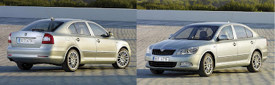 What is it about facelifts – are they given to the B-team or the office juniors? Changing certain elements of an existing design and successfully integrating them is a tricky task, but all too often the results are poor because the job is done with little skill, or sympathy with the original.
Although the Octavia's facelift is not disastrous, it's hardly a good example of the art either. At the back the changes seem confined to the lights and bumper, so not much to get wrong here. The new light is basically the old one with the central block of red now rendered in silver and a new simple, elegant bumper. So far, so good. The problem is at the front where the bumper, lights, front wings, grille & possibly bonnet have been changed.
Though understated, the Skoda Superb is handsome and this is surely the direction in which Skoda wanted to Octavia to move. At the front, one of the key features is the headlight. Although this graphic is not unique (see certain Honda and Mitsi models) it is crisply executed here and, as with the fat almond shape is shared by the Fabia and Roomster, I expected the Octavia to sport some variation on the the Superb's theme.Whilst the lower airdam & driving light do mimic the Superb, the only aspect of the headlights copied is the chrome strip embossed with the model name (but here is seems slightly askew.) Not only does the anonymous, amorphous (sort of a squashed Corsa shape) silhouette share nothing with any other Skoda, it simply does not fit in with the rest of the car in terms of either graphics or surfacing. This is a design fault: the scope of the changes at the front did not constrain the solution so as dictate such a result.Maybe I'm being a pedant – it's only a headlight after all; but given the manhours and money spent on changing just this one item, a little more thought and effort at the design stage would have yielded a much better result for something that will be seen in showrooms all over the world for the next four years.Ssangyong C200 Ssangyong in (fairly) good looking car shock! Thus far Ssangyong have been purveyors of almost wilfully ugly cars, but the C200 reverses this. From the front it has the aspect of a Grand Vitara, (no bad thing) and, dare I say it, a hint of LRX – but that could just be the paintjob. It remains to be seen how and when the headlights / grille get translated into production, but hopefully the overall graphic will survive.
By the same token, let's hope that the rear is revised. The surface feature over the haunches is not necessary and poorly executed: it droops rather than swooshes and forces the rear doorhandle higher than it wants to be. The matching window line is also unnecessary and the rear door shutline needs more definition.
The rear light graphic is crude, contrived and doesn't really relate to anything other than the aforementioned swoosh and the odd underlining swage line. Simpler, cleaner light units would work better. They've gone for faux sump guards on all four sides but just get away with it by not being too overstated.
However, let's get this in perspective: this is a design from the people who've given the world the Rodius, Kyron, & Actyon. Even if the C200 were put in production unchanged it's a clean, modern design light years ahead of anything seen from them previously.
 In this current economic crisis where everyone from Toyota down is feeling the pain, Land Rover – by the very nature of their product portfolio – is hurting more than most: we can only hope that this spurs Tata to fast-track the production LRX rather than delay it – a new compact, efficient model is exactly what LR needs. The reborn Range Rover, Discovery 3, Range Rover Sport and Freelander II are all products of a marque fully in control of their design language; the only bum note are the indignities foisted upon the Defender, but these were apparently the fallout from a change of engine and pretty minor anyway. In many ways LR is an object lesson in managing visual identity: the Defender, Freelander, Discovery, RR Sport and Range Rover each have their own distinct identity but all are recognisably a Land Rover. Of course it helps there are relatively few model lines (each with few iterations) and they share a common theme (off road ability) - but it still an impressive achievement: compare & contrast with the woeful state of Jeep design.


